At the end of last year, we started our Living Room Makeover, which included the lounge and dining area of our home. These areas have pretty much been left to their own devices since we moved in, over four years ago. There were other, more pressing projects, which we needed to tackle first.
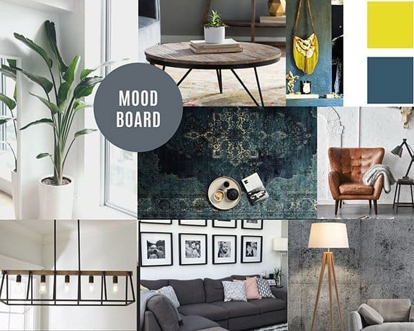
Living Room Makeover Mood Board
Before getting started on the project I created a mood board of ideas, which I wanted to include in the space. I find that this helps when you are trying to make decisions regarding colours and textures, as well as giving you a clear vision for the end product.
Creating a Blank Canvas
For me, one of the most significant impact elements to any room makeover has to be the floors and walls, primarily due to the volume of space they usually cover. This is especially true for our Living Room Makeover, as the lounge, dining room, and kitchen are open plan.
Fundamentally we decided to go the minimalist/less-is-more route as a primary theme. With this in mind, we painted the walls a matt white. White roller blinds replaced the curtains, hence less clutter, cleaner lines, creating a “blank canvas” for decorating.
Upcycling
Our budget for this project did not allow for the redesign or replacement of our fireplace. The fireplace surround, unfortunately, was quite intrusive, in size as well as style. Raw stone cladding topped by an aged, wooden sleeper for a mantle, are all quite imposing. Simply plastering over the stone cladding seemed like a bit of a waste of the material. Both Grant and I love wood as a feature, so it was important for the mantle to stay.
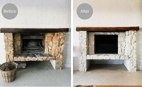
The belt sander worked wonders, and soon the wood was looking its natural self, lighter and full of character. Diluted chalk paint was the answer to our harsh looking stone and cement problem. I used a combination of a light grey, and off-white paint colours, which provided a wonderful whitewash effect. Lastly, after a light sanding, the inside of the fireplace was treated to a new coat of black paint. Et voilà, fireplace sorted!!
New Flooring
The most exciting part of this living room makeover was making over the old screeded floors! There was much back and forth deciding on floors but we eventually made a decision.
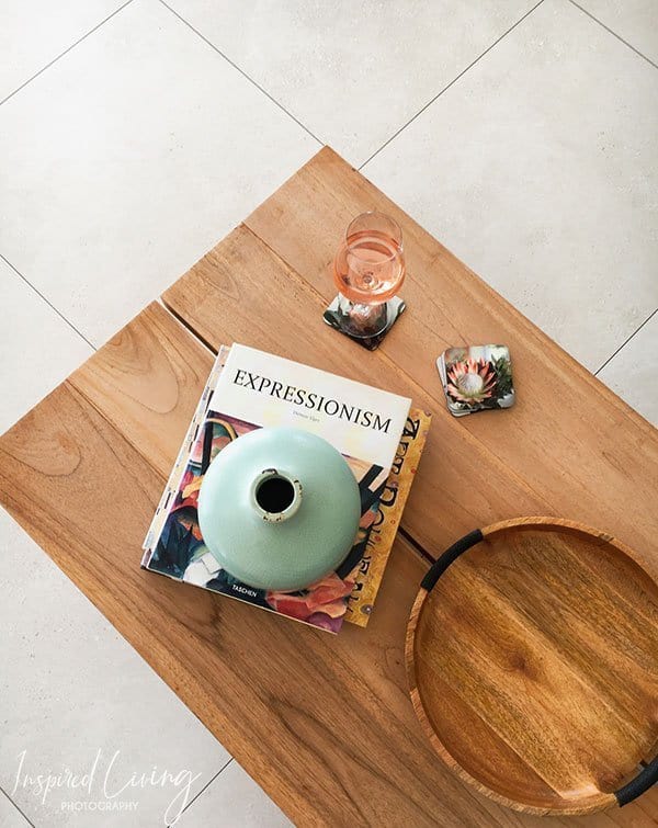
To further transform the space, we have used beautiful, matt white, porcelain tiles, with a hint of grey. These new floors have been a long time coming.
With the floors sorted, it left us with the few essential decor items and impact pieces to complete the picture.
Reupholstery
We really loved our L-shaped couch, which is originally from Weylandts but it required some TLC. The structure is still solid, and the design great, but the fabric tired and worn. Instead of simply replacing the entire unit, we decided to reuse the base and recover with new material – a tad more upcycling if you will!
Hertex has always been synonymous with incredible fabrics and carpets. For the couch, my vision was a medium to dark grey shade. We selected “Lava” from the Hertex Fable range, which is ideal for upholstery due to its thick composition and soft texture.
Finishing Touches
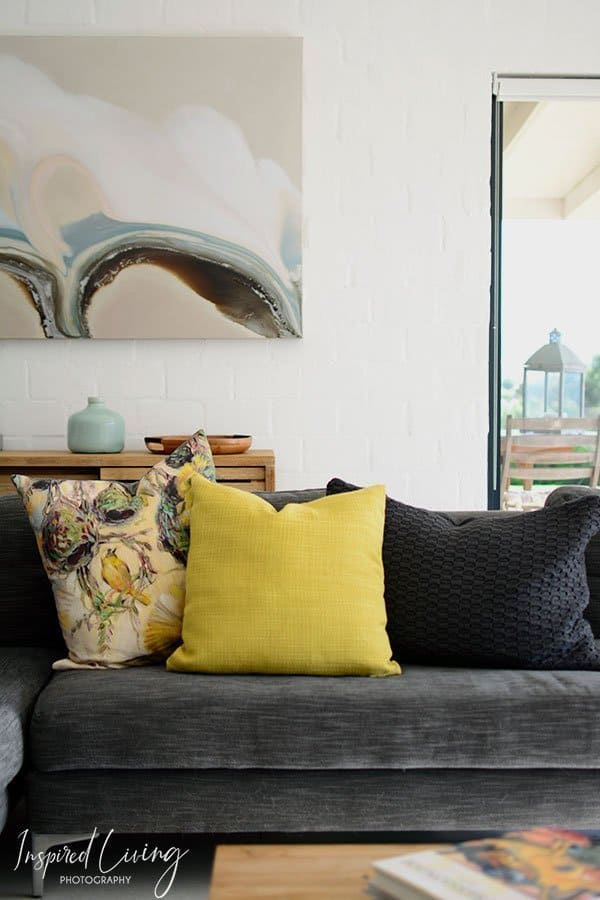
To avoid a look which is too stark and to add some flair, we chose shades of grey, blue and citrine as our accent palette.
Another important aspect is to bring a few more interesting textures into the room. This project is still a work in progress, and the idea is to incorporate two leather or velvet-upholstered armchairs, as well as nested side tables, and a large rug. I also have my eye on a lantern style chandelier for our lounge area.
The last touch would be the addition of greenery, and I am thinking a selection of medium to large indoor plants.
I will share a few more images once we have added the last few finishing touches.
Images
©2010 – 2020 Inspired Living and Fiona Rossiter. Please do not use any images featured on this website without written consent from the copyright holder and owner.
If you have enjoyed this feature, please share it by hitting the buttons below⇓.





Hi there, I love your style and technique. Myself, I love to decorate and be creative. I would love your opinion on a chandelier we have that needs a revamp, but not quite sure what to do. Would you mind if I sent you a picture? Our home has soft off white, light Grey and earth tones and the chandelier is dark and does not fit the look. Was here when we bought the house. Thinking of spraying it white perhaps or silver… Regards Maryké
Hi Maryke, thank you! I love decorating it is so satisfying to see a space come together! Perhaps you can email me a photograph of the chandelier as well as the room it is hanging in and I can try and give you some input. My email is [email protected]. Look forward to hearing back from you
Kind regards Fiona